7 Timeless Kitchen Color Schemes for Your Home
- demoore5506
- Aug 28, 2025
- 10 min read
Kitchen design is more than picking a pretty color combo. It actually shapes how a space looks and feels for decades. But get this. Over 75 percent of homeowners regret chasing trendy kitchen colors that quickly go out of style. Timeless color schemes are different. They stay fresh and welcoming year after year and can even raise your home’s value in the long run.
Table of Contents
Quick Summary
Takeaway | Explanation |
Choose timeless color schemes | Opt for colors like white, gray, or beige that endure over time and remain appealing. |
Embrace versatile neutrals | Colors like soft gray and warm beige provide a flexible backdrop for diverse styles and accents. |
Incorporate accent colors strategically | Use the 60-30-10 rule to create balance, with 60% neutral, 30% secondary, and 10% accent colors. |
Select durable materials | Natural wood and stone not only age gracefully but also enhance the kitchen’s long-term beauty. |
Connect with nature using greens | Earthy green shades foster a calming atmosphere, promoting well-being and harmony in the kitchen. |
1: Understanding Timelessness in Kitchen Design
Kitchen design is more than just a temporary aesthetic choice it’s an investment in your home’s long term beauty and functionality. When we talk about timeless kitchen color schemes, we’re referring to color palettes and design elements that transcend fleeting trends and maintain their appeal across decades.
According to the National Kitchen & Bath Association, timeless design focuses on enduring style that invites individual expression while maintaining core principles of visual harmony. This approach ensures your kitchen remains elegant and functional well beyond current design fads.
Key characteristics of timeless kitchen design include:
Neutral color foundations that provide flexibility and longevity
Classic materials like natural wood and stone that age gracefully
Clean lines and simple geometry that resist passing design trends
Choosing a timeless color scheme means selecting colors that complement your home’s architecture, create visual balance, and reflect your personal style without feeling dated. Think of colors that have demonstrated staying power white, soft grays, warm beiges, and muted earth tones.
For homeowners seeking to create an enduring kitchen aesthetic, explore our guide on modern kitchen design ideas that blend contemporary sensibilities with timeless elegance. The goal is not just visual appeal but creating a space that feels comfortable, functional, and personally meaningful for years to come.
2: Classic White: A Clean and Bright Choice
White remains the quintessential timeless kitchen color scheme, representing purity, simplicity, and endless design potential. Its versatility allows homeowners to create spaces that feel simultaneously modern and traditional, making it a perennial favorite among design professionals.
According to scientific research on color perception, white is psychologically associated with cleanliness and spaciousness, which explains its enduring popularity in kitchen design. These psychological attributes make white an exceptional choice for creating an inviting and refreshing culinary environment.
Key advantages of white kitchen color schemes include:
Maximized natural light reflection creating brighter spaces
Visual expansion making smaller kitchens feel larger and more open
Incredible design flexibility allowing easy accent color integration
White kitchens offer remarkable adaptability. Whether you prefer a crisp, modern aesthetic or a warm, traditional atmosphere, white provides an ideal neutral foundation. The color allows you to experiment with different textures, hardware finishes, and complementary colors without overwhelming the space.
When selecting white tones, consider subtle variations that prevent clinical starkness. Warm whites with slight cream or beige undertones create a softer, more inviting atmosphere. Cool whites with slight gray undertones deliver a contemporary, clean look. Explore our comprehensive guide to cabinet color selection to find the perfect white that resonates with your home’s unique character.
Remember that white is not a single color but a spectrum of nuanced tones, each capable of transforming your kitchen’s entire emotional landscape.
3: Soft Gray: Versatile and Elegant
Soft gray emerges as a sophisticated and timeless kitchen color scheme that bridges modern minimalism and classic design sensibilities. This nuanced neutral offers homeowners an opportunity to create spaces that feel simultaneously contemporary and enduring.
According to research in color psychology, soft gray has remarkable emotional and visual qualities that make it an exceptional choice for interior spaces. Its ability to evoke calm and provide visual depth sets it apart from more stark neutrals.
Key characteristics of soft gray kitchen color schemes include:
Exceptional design versatility allowing seamless transitions between design styles
Subtle visual warmth that prevents spaces from feeling cold or sterile
Remarkable compatibility with various accent colors and materials
Gray tones range from light, whisper-soft shades to deeper, more dramatic hues. Lighter grays create an airy, spacious feel, while medium grays provide sophisticated depth. Warm gray tones with subtle brown or taupe undertones can introduce a sense of coziness without compromising modern aesthetics.
Practical considerations make soft gray particularly appealing. The color effectively masks minor imperfections, resists showing dirt or wear, and provides a neutral backdrop that can evolve with changing design trends. Pairing soft gray with natural wood elements, metallic accents, or bold color highlights allows for personalized expression.
Learn more about selecting the perfect cabinet colors to transform your kitchen into a timeless, elegant space that reflects your unique style. Soft gray represents more than a color choice it’s a design strategy that promises enduring beauty and flexibility.
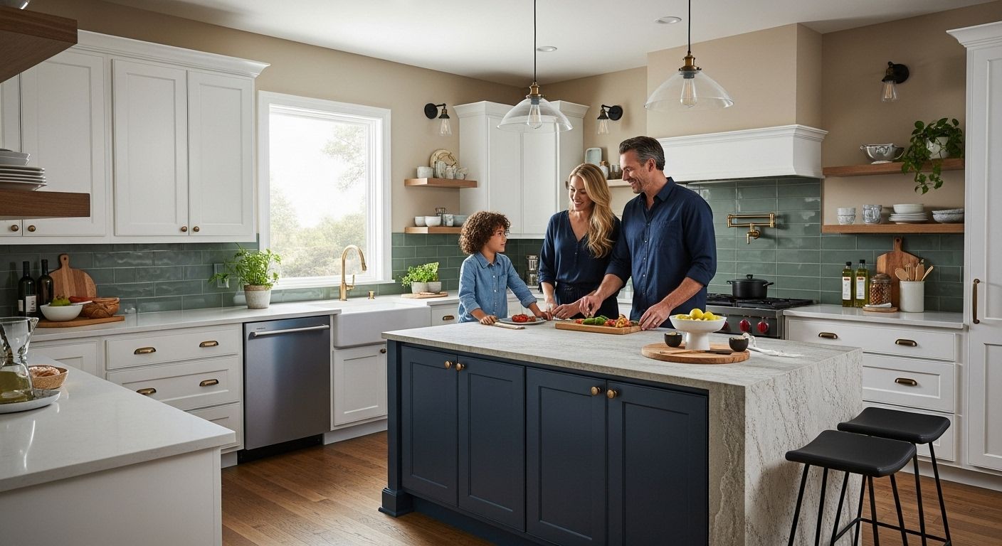
4: Deep Blue: A Bold Yet Calm Option
Deep blue emerges as a sophisticated and emotionally resonant kitchen color scheme that transcends traditional neutral palettes. This rich, complex hue offers homeowners a bold design statement while simultaneously creating a sense of tranquility and depth.
According to scientific research on color psychology, blue interiors are uniquely positioned to evoke feelings of calmness and serenity. In kitchen design, deep blue represents more than a color choice it’s a strategic approach to creating an emotionally supportive environment.
Key advantages of deep blue kitchen color schemes include:
Emotional regulation promoting relaxation and reducing stress
Visual sophistication that communicates design confidence
Remarkable versatility in pairing with multiple accent colors
Deep blue offers remarkable design flexibility. Navy and midnight blue tones can function as neutral backdrops, while richer cobalt and marine blues create dramatic focal points. Lighter blue undertones prevent the color from feeling overwhelming, ensuring the kitchen remains inviting and balanced.
Consider deep blue for kitchen elements like cabinetry, accent walls, or statement islands. Pairing deep blue with warm metallic hardware brass or copper creates stunning visual contrast. Natural wood elements like butcher block countertops or open shelving can soften the intensity, creating a harmonious design narrative.
Explore our guide to transformative kitchen color strategies to understand how deep blue can elevate your kitchen’s aesthetic. This timeless color scheme promises to deliver both emotional depth and design sophistication.
5: Warm Beige: Cozy and Inviting Ambiance
Warm beige represents a timeless kitchen color scheme that embodies comfort and sophistication. This versatile neutral creates an inviting atmosphere that feels both elegant and approachable, making it an ideal choice for homeowners seeking a welcoming culinary space.
According to research on interior color psychology, warm neutrals like beige have a profound impact on emotional perception, promoting feelings of safety and tranquility. In kitchen design, this translates to a space that feels inherently comfortable and nurturing.
Key benefits of warm beige kitchen color schemes include:
Emotional warmth that encourages family gathering and connection
Remarkable adaptability across various design aesthetics
Subtle sophistication that maintains visual harmony
Beige offers an extraordinary range of undertones from sandy cream to rich caramel. Lighter beige tones create an airy, expansive feel, while deeper shades introduce depth and intimacy. The color’s neutrality allows for effortless integration with diverse materials like granite countertops, wooden accents, and metallic hardware.
Practically speaking, beige kitchens resist showing wear and tear more effectively than stark white spaces. Its forgiving nature makes it an excellent choice for busy households where aesthetic longevity matters.
Discover expert insights into selecting the perfect kitchen palette to transform your cooking space into a sanctuary of warmth and style. Warm beige isn’t just a color it’s an invitation to create lasting memories.
6: Earthy Greens: Bringing Nature Indoors
Earthy green emerges as a transformative kitchen color scheme that connects interior spaces with natural tranquility. This nuanced palette brings the serene essence of outdoor environments directly into your culinary workspace, creating a harmonious and refreshing atmosphere.
According to research on color psychology, green is fundamentally associated with balance, harmony, and emotional restoration. In kitchen design, earthy green tones offer more than aesthetic appeal they provide a profound sensory experience that promotes calm and well-being.
Key characteristics of earthy green kitchen color schemes include:
Stress reduction through connection with natural color palettes
Visual depth that creates sophisticated design narratives
Remarkable versatility in complementing various materials and textures
Earthy green encompasses a stunning spectrum from sage and olive to muted khaki and forest tones. Softer green hues create a subtle backdrop, while deeper shades introduce dramatic visual interest. Pairing green cabinetry with natural wood elements or stone countertops amplifies the organic, grounded feeling.
Consider incorporating green through strategic design elements like lower cabinets, accent walls, or statement islands. Metallic hardware in brass or copper can beautifully complement green tones, adding warmth and contemporary sophistication.
Explore our comprehensive guide to kitchen design transformations to discover how earthy green can elevate your kitchen’s aesthetic and emotional landscape. This timeless color scheme promises to deliver both visual harmony and a profound sense of connection to nature.
7: Using Accent Colors Effectively in Your Kitchen
Accent colors represent the strategic punctuation marks in kitchen design, transforming neutral palettes from understated to extraordinary. Thoughtful color integration can elevate your kitchen from merely functional to visually compelling and personally expressive.
According to design principles research, accent colors work best when they create intentional visual rhythm and balance. They serve as focal points that draw the eye and create dynamic interest within the space.
Key strategies for effective accent color implementation include:
Selective placement that creates visual intrigue
Balanced distribution preventing color overwhelm
Harmonious color relationships that feel intentional
Consider vibrant accent colors like deep red, emerald green, or mustard yellow. These bold choices can be introduced through small appliances, backsplash tiles, bar stools, or decorative elements. Metallic accents such as copper, brass, or gold hardware can also provide sophisticated color punctuation without dominating the overall design.
The 60-30-10 color rule provides an excellent framework. Allocate 60% to your primary neutral color, 30% to a secondary color, and 10% to your accent color. This proportional approach ensures visual balance while allowing personality to shine through.
Explore our comprehensive guide to kitchen color strategies to transform your space with confidence. Accent colors are not just decorative elements they are powerful design tools that communicate your unique style and create emotional resonance within your kitchen.
Below is a comprehensive table summarizing the main kitchen color schemes, their key features, and the benefits highlighted in the article.
Color Scheme / Strategy | Core Features & Description | Key Benefits |
Classic White | Clean, bright, adaptable; fits both modern and traditional designs | Maximizes light, makes spaces larger, flexible with accents |
Soft Gray | Sophisticated, versatile neutral; blends classic and modern; various undertones available | Warmth without coldness, conceals imperfections, design flexibility |
Deep Blue | Bold yet calming; creates depth; effective for cabinetry or islands | Promotes calm, visual sophistication, works with metallics |
Warm Beige | Cozy, inviting, and approachable; wide range of tones | Emotional warmth, resists wear, blends across styles |
Earthy Greens | Brings nature indoors; calming shades like sage, olive, forest | Reduces stress, supports well-being, pairs with woods/metals |
Accent Colors (Usage Strategy) | 60-30-10 rule for visual balance; bold color pops in selective elements | Adds personality, creates focal points, ensures harmony |
Timeless Design Principles | Neutral bases, classic materials, simple lines, durability, integration of personal style | Visual longevity, value retention, enduring aesthetic appeal |
Bring Your Dream Kitchen Color Scheme to Life With Ottawa Cabinet Painting
You have just read about the timeless power of classic color palettes like white, gray, deep blue, earthy greens, and warm beige. But maybe you are worried about how to actually achieve that fresh, high-end look without a disruptive renovation or overspending. Many homeowners want a kitchen that feels bright, inviting, and truly their own, but are held back by concerns about cost, chaos, and outdated cabinets. Ottawa Cabinet Painting is here to solve that challenge for you. Our specialized cabinet refinishing process lets you enjoy the latest timeless kitchen color schemes featured in the article, while avoiding the mess and expense of full replacement. With meticulous prep work, durable finishes, and beautiful results, you can finally experience a kitchen that feels new, warm, and functional for your family—without sacrificing your layout or budget. Explore how our services bring modern style and longevity to old cabinets on our main website and see what sets us apart.
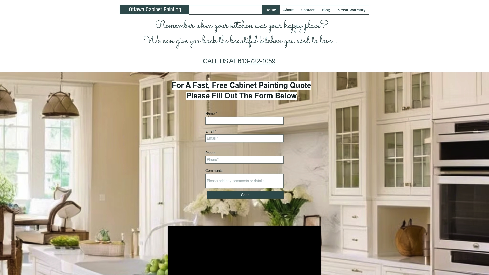
Ready to turn inspiration into reality? Discover how our cabinet painting services can help you achieve your favorite timeless color scheme and enjoy a beautiful, refreshed kitchen in just about ten days. Contact us today for a personalized quote and feel the difference a detail-focused local partner makes in your home. Do not let another year go by with a kitchen that does not reflect your taste—let Ottawa Cabinet Painting help you fall back in love with the heart of your home.
Frequently Asked Questions
What are timeless kitchen color schemes?
Timeless kitchen color schemes are color palettes that maintain their appeal and functionality over the years, transcending fleeting design trends. Common choices include neutral tones like white, soft gray, deep blue, warm beige, and earthy greens.
Why is white a popular choice for kitchen color schemes?
White is favored for its association with cleanliness and spaciousness. It reflects natural light, making spaces feel larger and brighter. Additionally, it offers design flexibility, allowing for easy integration of various accent colors and styles.
How can I incorporate accent colors into my kitchen?
Accent colors can be effectively integrated by using the 60-30-10 color rule, where 60% of the space is a neutral color, 30% is a secondary color, and 10% is an accent color. This creates visual balance while allowing your personality to shine through with bold choices in small appliances, decorative elements, or cabinetry.
What are the benefits of using soft gray in kitchen design?
Soft gray is a versatile color that provides visual warmth and depth without being overpowering. It can seamlessly transition between design styles, complements various materials, and effectively masks minor imperfections, making it a practical and sophisticated choice for kitchens.
Recommended
Comments