Kitchen Cabinet Colors for Small Kitchens: Ottawa Ideas
- Axcell Painting

- 2 days ago
- 10 min read
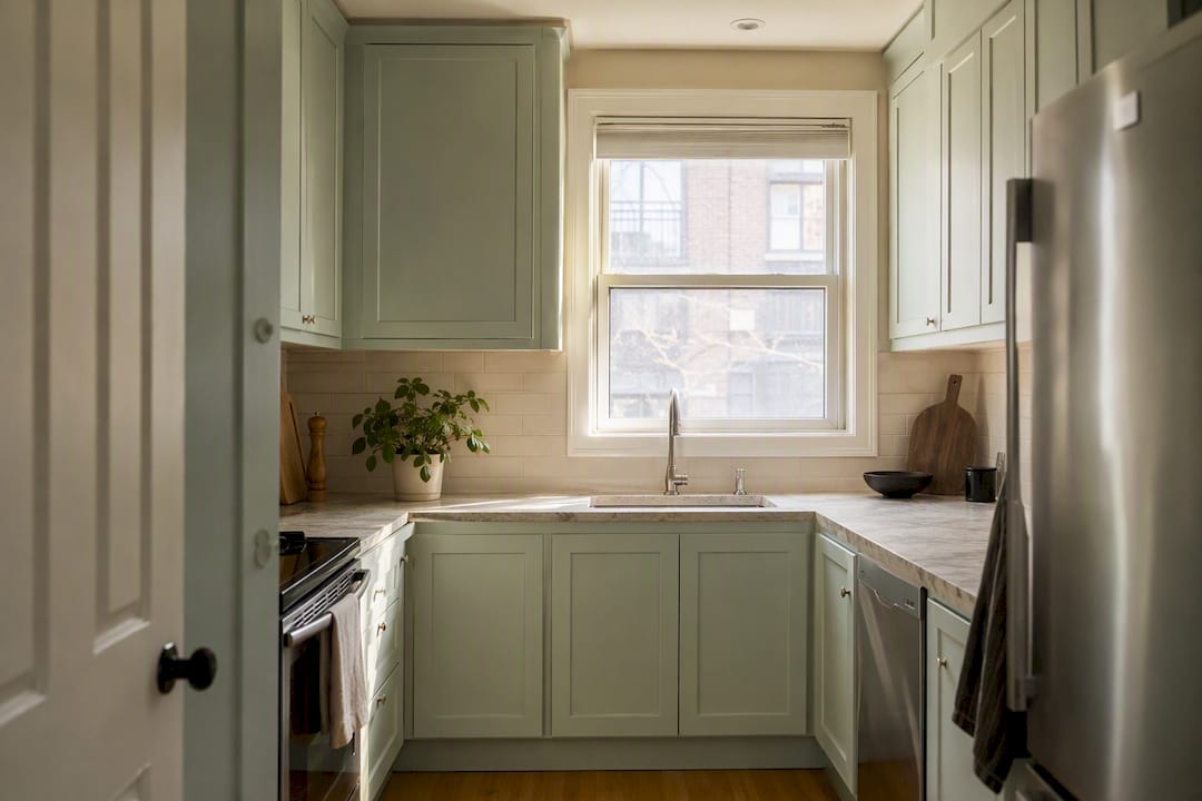
The most reliable way to make a small kitchen feel larger is a light, tonal palette carried from cabinets straight through to the walls and trim, with color choices that recede rather than advance. Matching cabinet and wall tones creates a tonal monochromatic scheme that can trick the eye into perceiving about 20 to 25% more spatial volume in a compact room. That single move does more work than any single “best” color.
Choose light neutrals or soft receding blues and greens over anything warm and advancing
Match cabinet color to your wall and trim tones for visual continuity
Save dark colors for an island or lower cabinets only, never full coverage in a tight footprint
Key Takeaways
A light, tonal cabinet palette carried through walls and trim, paired with correct finish and hardware choices, is the single most effective way to make a small kitchen feel larger.
Point | Details |
Choose receding colors | Cool blues, sage greens, and light neutrals recede visually and add perceived depth. |
Match tones for continuity | Align cabinet, wall, and trim colors to remove visual breaks in the room. |
Confine dark colors | Reserve navy, charcoal, or black for an island or lower cabinets only. |
Pick the right finish | Satin or eggshell balances light reflection with everyday durability. |
Test before committing | Paint large swatches and check them against countertops and floors in real daylight. |
Table of Contents
What Cabinet Colors Make a Small Kitchen Look Bigger?
Color affects perceived space through two mechanisms: how it bounces light and how your eye reads distance. Cool tones like soft blue and sage green are “receding” colors. They visually pull back from the eye, creating an illusion of depth that makes a small kitchen feel roomier. Warm reds, oranges, and saturated yellows do the opposite. They advance toward you, which shrinks a room that already lacks square footage.
Continuity matters just as much as the color itself. When cabinets, walls, trim, and ceiling share one light palette, your eye stops registering the “breaks” between surfaces, and a small kitchen reads as one open volume instead of a chopped-up box.
Finish plays a supporting role. Higher sheen finishes bounce more light around the room, while matte finishes absorb light and can make walls feel closer.
Pro Tip: If your kitchen faces north, lean toward warmer whites and greiges to counteract cool, flat daylight. South-facing kitchens can handle cooler whites and blues without feeling sterile.
Best Cabinet Colors for Small Kitchens, Ranked
Not every light color performs the same way, and not every trend-forward shade belongs on every cabinet. Here is how the leading small-kitchen color families stack up.
Warm soft white or off-white remains the safest bet for tight galleys and windowless kitchens. It reflects the most available light and pairs cleanly with pale quartz counters, subway tile backsplashes, and brushed brass hardware. It is also the easiest color to sell a house with later, since it reads neutral to nearly every buyer.
Greige and light gray solve the one real complaint about pure white: it can feel cold and clinical under fluorescent or LED light. Greige and taupe reflect light while adding warmth, which suits kitchens with north-facing windows or minimal natural light. Pair with warm wood floors and a marble-look laminate or quartz counter to keep the palette from feeling flat.
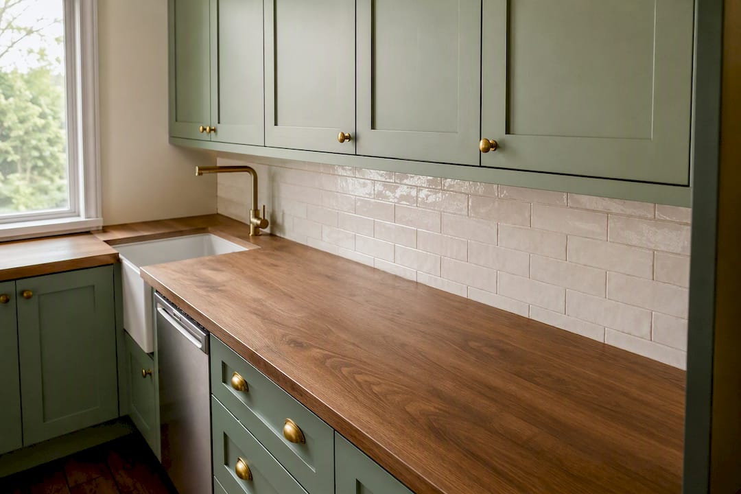
Muted sage or soft green is the standout for 2026. Industry trend trackers now name muted green as the fastest-growing cabinet color, and because it falls into the receding color family, it delivers depth without the commitment of navy or black. Best in kitchens with decent natural light, sage pairs beautifully with butcher block, unlacquered brass, and cream subway tile. Picture a small galley with sage uppers, a white oak floor, and a pale quartz counter for reference.
Light blue works the same receding trick as sage but reads cooler and more coastal. It suits bright, south-facing kitchens best; in a dim room it can feel chilly without warm-toned counters or wood accents to balance it.
Pale taupe splits the difference between greige and off-white. It is a quiet, resale-safe choice for renters or owners who want warmth without committing to a color statement.
Two-tone schemes (light upper cabinets, a slightly darker lower run) give a small kitchen visual interest without sacrificing the light-and-airy effect overhead, since the eye still reads the upper half of the room as open. This is also where 2026 trend data points hardest: warm whites paired with colored lowers or islands show up repeatedly in current kitchen design coverage.
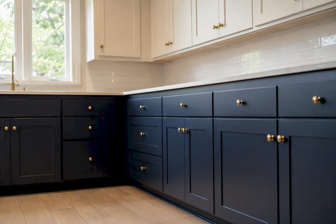
Navy, charcoal, and black deserve a place on this list, but only in moderation. These colors work best on an island, a run of lower cabinets, or a single accent wall of storage, paired with white or light upper cabinets rather than applied across every surface. In a very small footprint with limited windows, full dark coverage will make the room feel smaller no matter how good it looks in photos.
Do Finishes and Hardware Affect How Big a Kitchen Looks?
Finish and hardware decisions either reinforce your color strategy or quietly undo it. Satin and eggshell finishes reflect a moderate amount of light without the glare of high gloss, which makes them the safest all-around choice for small kitchen cabinets. Full gloss bounces the most light and can brighten a dim kitchen dramatically, but it also shows every ding and fingerprint. Matte trims reflection almost entirely, so it reads sophisticated but can make a tight room feel a touch more closed in.
Hardware finish matters more than most homeowners expect. Brass, warm nickel, and matte black all create a point of contrast against a light cabinet, and a little contrast at eye level actually helps define depth rather than flatten it.
Layout tricks compound the effect. Glass-front uppers, cabinets extended to the ceiling, and paneled refrigerator or dishwasher fronts all reduce the visual clutter of mismatched appliance faces and open storage gaps.
Avoid high-contrast trim lines between cabinet doors and face frames
Skip heavy dark lower cabinets in a tight galley unless you are compensating with strong overhead light
Match interior door colors nearby to your cabinet palette; color consistency between doors and cabinetry keeps sightlines from a small kitchen into adjoining rooms from breaking the illusion of space
How Do You Test Cabinet Paint Colors Before Committing?
Evaluate your light. Note whether your kitchen faces north or south, and check your bulb temperature (warm 2700K versus cool 4000K light changes how a color reads).
Narrow to two or three finalists. Pick from light warm white, greige, or sage/soft blue based on your light direction and existing counters and floors.
Test large swatches, not paint chips. Paint a two foot by two foot panel on an actual cabinet door, or use a peel-and-stick sample, and observe it at multiple times of day before deciding.
Check contrast against your countertop and floor. Favor a higher light reflectance value if your kitchen is dim, and test a hardware sample against the same swatch.
Print or photograph your swatch in morning, midday, and evening light
Hold the sample next to your countertop and flooring, not just the wall
Test one hardware finish alongside the paint swatch before ordering
DIY or Professional Cabinet Painting in Ottawa?
A DIY cabinet repaint can save money upfront, but brush marks, uneven primer coverage, and rushed drying time are the most common reasons a homeowner ends up repainting within a year. A sprayed, professionally prepped finish holds up longer and looks factory smooth from day one.
Ottawa Cabinet Painting typically runs a project over about ten days, which covers hardware removal, sanding, priming, spray or brush application, and reassembly, with a six-year warranty backing the finish. That timeline reflects the reality that proper prep, not the paint itself, is what determines how long a finish lasts.
Hire a pro for two-tone jobs, island refinishing, or any project where a sprayed finish is the goal
Expect several days of drying and cure time between coats, not just overnight
Ask about warranty terms before comparing quotes on price alone
Pro Tip: If a quote promises a full kitchen repaint in two or three days, ask exactly how much dry time each coat gets. Rushed cure time is the number one cause of early paint failure on cabinets.
How Color Affects the Feel of a Small Kitchen
Color does more than bounce light around a room; it shapes mood every time you walk in. Soft greens and blues tend to read as calming and restorative, which matters in a kitchen you might spend an hour in every evening. Warm whites and creams read as clean and inviting without feeling sterile, which is part of why they remain the default choice for small kitchens that double as a gathering spot.
Deep, saturated colors carry psychological weight too, and not always in a bad way. A navy island in an otherwise light kitchen can feel grounding rather than cramped, giving the eye a place to rest. The mistake is applying that same saturated color to every surface in a small room, where it stops feeling intentional and starts feeling heavy.
Contrast also affects how “busy” a kitchen feels mentally, not just visually. High-contrast two-tone schemes can energize a space, while a tonal, low-contrast palette tends to feel quieter and more restful. Neither approach is wrong. The choice comes down to whether your small kitchen needs to feel like a calm retreat or an energetic focal point, and that is a personal call as much as a design one.
Which Cabinet Finishes Hold Up Best Over Time?
Durability depends more on finish type than on color choice itself, though certain colors expose wear faster. Dark, saturated cabinet colors, especially matte black and deep navy, show scratches, water spots, and fingerprints more visibly than mid-tone neutrals. Light greiges and warm whites hide everyday scuffs better, which matters most on high-traffic lower cabinets and drawer fronts near a sink or stove.
Satin and eggshell finishes strike the best balance of durability and low maintenance for daily kitchen use. They wipe clean easily and resist showing minor imperfections better than either high gloss or dead matte. Full gloss finishes are the most durable against moisture but the least forgiving visually, since every fingerprint and water spot shows immediately under kitchen lighting.
Premium paint systems with proper primer and multiple thin coats consistently outlast a single heavy coat of off-the-shelf paint, regardless of color. That is the real driver behind a six-year warranty claim on professionally refinished cabinets: the prep and paint system matter more than the pigment. Readers weighing colors against long-term upkeep can find more detail in this cabinet refinishing durability guide, which breaks down how different finish systems perform under daily wear.
Choosing Cabinet Color With Countertops and Floors in Mind
Cabinet color never exists in isolation. A pale quartz counter with cool gray veining will make a warm off-white cabinet look slightly yellow by comparison, while that same counter makes a true greige look crisp and intentional. Undertone matching between cabinets and countertops is one of the most overlooked steps in small kitchen planning, and it is also one of the easiest to get wrong from a paint chip alone.
Flooring carries similar weight. Warm wood tones ground a cool blue or sage cabinet nicely, keeping the room from feeling sterile. Cooler gray-toned flooring pairs more naturally with greige or true white cabinets, since matching undertones across floor and cabinetry reduces visual noise in a room that has little square footage to spare.
Light reflectance value, or LRV, is worth checking on both your countertop and flooring samples, not just your paint swatch. A small, dim kitchen benefits from stacking higher LRV materials, meaning a light counter and a light-to-mid floor alongside a light cabinet, so the whole room bounces available light rather than absorbing it. Mixing one dark surface into an otherwise light small kitchen is fine; stacking two dark surfaces, such as a dark floor under dark lower cabinets, tends to make a tight room feel noticeably smaller no matter how good the individual colors are.
Ready to Update Your Ottawa Kitchen Cabinets?
Picking the right color is only half the equation. The finish has to be applied correctly to actually look and perform the way these color strategies promise, and that is where most DIY repaints fall short. Ottawa Cabinet Painting handles the full process, from prep and priming through spray application, on a typical ten-day timeline backed by a six-year warranty, whether you are refreshing a full kitchen or just repainting an island to try one of these 2026 color trends.
If you are weighing the cost of a full renovation against a color refresh, cabinet painting also tends to deliver strong return relative to cost, since kitchen updates consistently rank among the highest-value home improvements a homeowner can make. Browse real results in the before and after gallery, or request a free quote to see what a professional refinish would cost for your kitchen’s exact layout.
A Practical Take on Small Kitchen Cabinet Colors
Most small-kitchen color advice stops at “paint it white,” and that advice is not wrong so much as incomplete. Plenty of small kitchens with white cabinets still feel cramped because the walls, trim, and floor were never brought into the same tonal family. The color of the cabinet door matters less than whether the whole room reads as one continuous surface.
The other place conventional advice falls short is on dark colors. Homeowners either avoid them entirely out of fear, or go all in on a moody navy kitchen because it looked good in a magazine spread shot with professional lighting. Neither extreme serves a genuinely small kitchen well. The smarter move is treating dark color as a design accent, confined to an island or a lower run, while letting the rest of the room stay light and continuous.
If there is one thing worth prioritizing first, it is testing your swatch against your actual counter and floor, in your actual light, before committing to any color on this list.
Frequently Asked Questions
What colors make a small kitchen look bigger? Light neutrals like warm white and greige, plus receding cool tones like sage green and soft blue, make small kitchens feel larger, especially when carried through to the walls and trim.
Are dark cabinet colors ever a good idea in a small kitchen? Yes, but only as an accent. Navy, charcoal, or black work best on an island or lower cabinets paired with light upper cabinets, not as full coverage in a tight footprint.
What is the best cabinet finish for a small kitchen? Satin or eggshell offers the best balance of light reflection and daily durability. Gloss brightens a room more but shows fingerprints, while matte reduces glare but can feel heavier.
How long does professional cabinet painting take in Ottawa? Ottawa Cabinet Painting typically completes a full project in about ten days, covering prep, priming, spray application, and reassembly, backed by a six-year warranty.
Should cabinet color match the countertop or the floor? Both, ideally. Matching undertones across cabinets, countertops, and flooring reduces visual noise, and stacking light-colored surfaces helps a dim, small kitchen feel more open.
Sources
Recommended

Comments