Sample Tested Kitchen Cabinet Colors for Ottawa in 10 Days
- Axcell Painting

- 1 day ago
- 11 min read
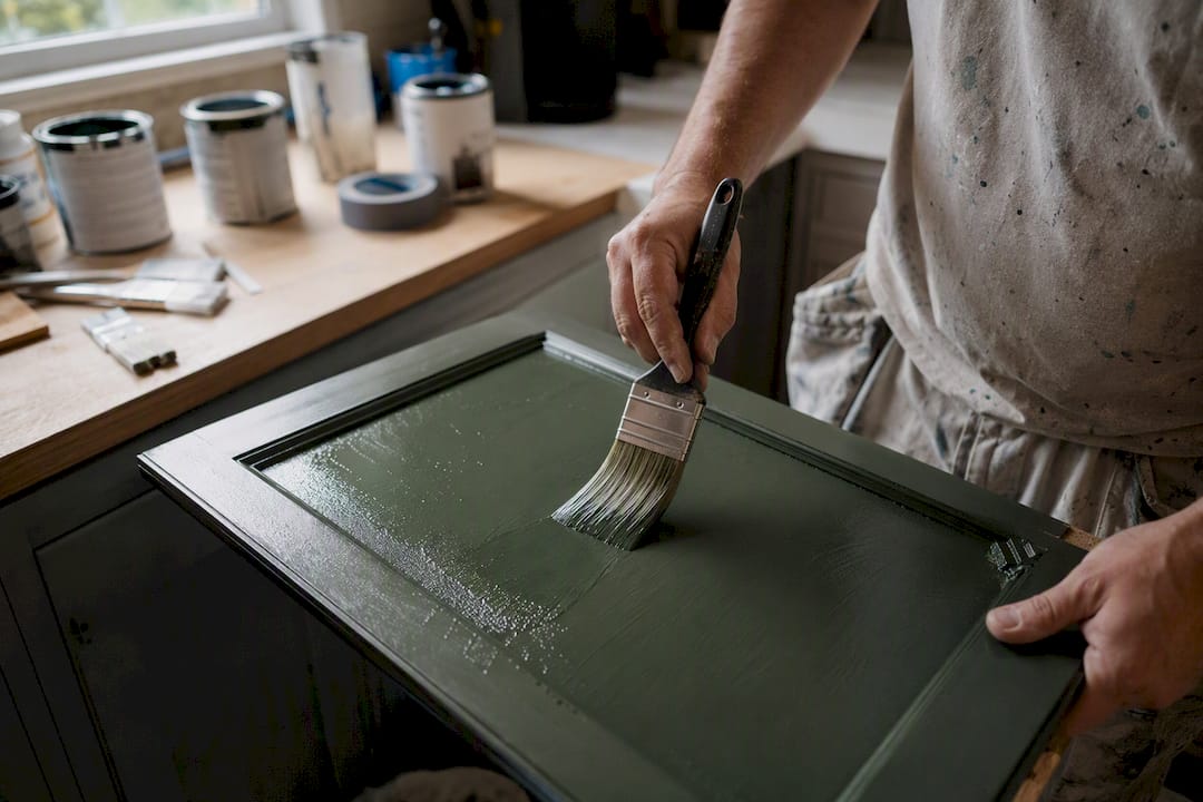
Warm off-whites, muted greens, deep navy, charcoal, and terracotta lead the pack of colors to paint kitchen cabinets this year. If you’re not sure where to start, a warm neutral or a two-tone island is the safest bet, blending resale appeal with real personality. At Ottawacabinetpainting, we’ve watched green climb fast in popularity, but the smartest move is always the same: sample large patches before committing.
TL;DR:
Opt for large test patches instead of small samples to accurately judge undertones and how the color reacts under your kitchen’s specific lighting conditions.
Use warm neutrals like off-white or greige for smaller, north-facing kitchens to maintain resale value and avoid looking dated in five years.
Keep two-tone schemes consistent by using the same hardware finish and repeating one cabinet color in other design elements for visual harmony.
Choose cabinet-specific enamel or alkyd paint in satin or semi-gloss sheen to withstand daily wear and ensure a smooth, durable finish.
Ottawa’s long winters and cooler natural light favor warmer, softer colors, and professional prep and spray application extend cabinet paint durability.
Table of Contents
Colors to Paint Kitchen Cabinets: A Quick Shortlist
Every kitchen has different light, size, and material constraints, so no single color works everywhere. Here’s a fast reference to match your space with a direction that actually suits it.
Warm off-white or greige — best for small or north-facing kitchens; the most resale-friendly option on this list.
Muted sage or moss green — best for kitchens with natural wood accents or brass hardware; trend-forward but softening fast into a classic.
Deep navy — best for well-lit kitchens with generous window coverage; pairs beautifully with brass or matte black hardware.
Charcoal or near-black — best for larger kitchens or islands only; delivers drama without swallowing a small room.
Terracotta or warm clay — best used as an island accent, not on full perimeter cabinetry.
Soft classic white — best for traditional layouts and buyers who want maximum flexibility down the road.
Two-tone combos (dark lower, light upper) — best for kitchens that want bold color without the commitment of an all-over dark scheme.
If none of that narrows it down fast enough, start with a warm neutral. It’s the least likely color family to look dated in five years, and it gives you room to change hardware or backsplash later without a full repaint.
Why Designers Favor Greens, Blues, Warm Neutrals, and Earth Tones
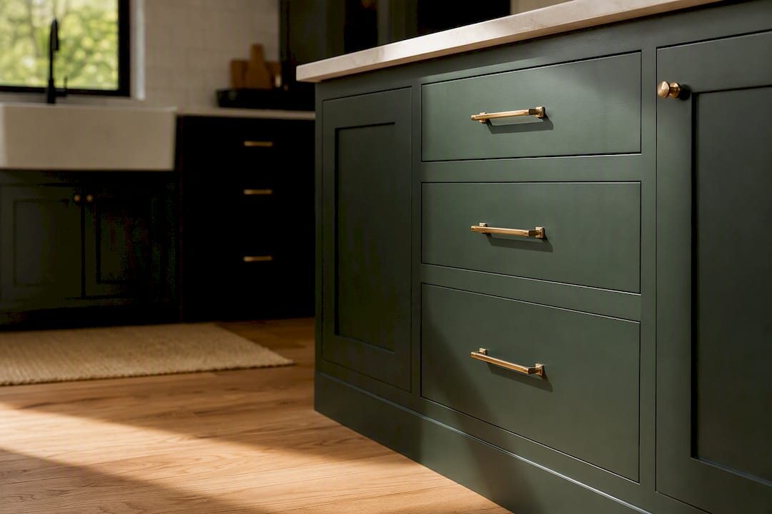
Trend coverage for 2026 keeps circling back to the same handful of families, and there’s a real logic behind each one. Livingetc’s cabinet paint coverage points to muted greens and warm neutrals as the two directions designers keep recommending, with green showing up as a genuine favorite rather than a passing fad.
Muted greens work because they read as nature-derived rather than trendy. Sage, moss, and olive all sit comfortably next to brushed brass, oil-rubbed bronze, or matte black hardware. They also pair well with white oak or walnut flooring, which softens the green rather than competing with it.
Deep blues and navy carry weight best when a kitchen already gets strong natural light. Use navy on an island first if you’re nervous about committing to a full room, and keep countertops light (quartz or marble-look surfaces) to avoid a heavy, closed-in feel.
Warm neutrals and greige remain the default recommendation for a reason. Regional trend data for Ontario kitchens notes that warm off-whites like ivory and linen read as far less clinical than stark white, especially under Canada’s cooler natural light.
Terracotta and earth tones work almost exclusively as accents. Keep upper cabinets in a neutral and let the terracotta live on the island or a lower bank of drawers.
Pro Tip: Test your hardware finish against your paint sample before ordering new pulls. Brass reads warmer against sage green than it does against navy, and that shift can change your whole plan.
Two-Tone Kitchens and Island Accent Ideas
The most common two-tone formula pairs a darker, bolder color on lower cabinets or the island with a lighter shade on the uppers. It works because it grounds the room visually while keeping sightlines open near eye level, and it gives you a low-risk way to try a trend color without living inside it on every wall.
Sage green island, warm white perimeter — a Livingetc-favored combo that reads timeless rather than trendy.
Navy island, warm greige perimeter — a pattern Ontario design studios keep repeating for its balance of bold and calm.
Charcoal lowers, cream uppers — strong contrast that works best in kitchens with 9-foot-plus ceilings.
Terracotta island, soft white perimeter — warms up an otherwise cool, white-heavy kitchen.
Moss green lowers, linen uppers — a gentler version of the sage-and-white pairing for smaller spaces.
Black island, warm off-white perimeter — a graphic look that reads modern without overwhelming a mid-size kitchen.
Whichever combination you choose, stick to one hardware finish throughout, and repeat one of the two cabinet colors somewhere else in the room, whether that’s open shelving, a range hood, or trim, so the palette feels intentional rather than accidental; for practical examples and inspiration, see Two Tone Cabinets: Ideas and How to Get the Look.
How Undertones and Lighting Change Your Cabinet Color
Paint chips lie. A color that looks perfect on a 2 by 3 inch card can shift dramatically once it’s on a full cabinet door under your actual light.
North-facing kitchens get cooler, bluer daylight, which tends to make paint colors read colder and grayer than expected. Favor warmer off-whites and greiges in those rooms to counteract the effect. South-facing kitchens can handle cooler-toned whites and even leans-blue grays without looking sterile, since the warm daylight balances them out.
Artificial light matters just as much. LED bulbs vary widely between “warm white” and “cool white” temperatures, and each shifts a painted sample differently.
Photograph your sample in morning, midday, and evening light.
Check it under both natural daylight and your kitchen’s actual overhead fixtures.
Look specifically for undertones (green, blue, or yellow casts) that only show up at certain times of day.
Guides recommending large test patches over small swatches exist for exactly this reason: bigger samples reveal undertone shifts that a paint chip simply can’t show you.
Paint Types and Sheens That Actually Hold Up on Cabinets
Cabinet doors take more daily abuse than almost any other painted surface in your home, so the product matters as much as the color. Sherwin-Williams’ kitchen paint guidance points buyers toward cabinet-specific enamels and waterborne alkyds over standard wall paint for exactly this reason.
Waterborne alkyds level beautifully and cure to a hard, furniture-like finish, though they need longer dry time between coats.
Acrylic cabinet enamels dry faster and resist yellowing, a solid middle ground for most kitchens.
Standard acrylic latex works in a pinch but tends to chip and scuff faster near handles and hinges.
Satin or semi-gloss sheens are the professional standard because they wipe clean without showing every brush mark the way high-gloss does. A primer coat followed by two topcoats is the baseline most painters won’t skip, and spraying rather than brushing is what actually produces that silky, factory-smooth surface homeowners picture when they imagine a repaint.
A Simple Way to Test Cabinet Colors Before You Commit
Don’t trust a paint chip. Test the real thing, in your real kitchen.
Paint large removable panels or a spare cabinet door rather than a small swatch card.
Prop the sample near your countertop and hardware, not against a bare wall.
Leave it up for at least two to three days, checking it morning, afternoon, and evening.
Watch closely for any green, blue, or yellow undertone that only appears under certain light.
Pro Tip: Photograph each sample at the same time every day. Side-by-side photos make undertone shifts far easier to spot than relying on memory.
How Color and Finish Choices Affect Long-Term Upkeep
Darker colors and matte finishes show dust, water spots, and fingerprints more readily than lighter satin finishes, especially near handles and the sink zone. Warm neutrals in satin sheen tend to hide daily wear the best, which is part of why they remain such a popular default.
Avoid abrasive cleaners and scouring pads on any painted finish; they dull the sheen over time.
A mild dish soap and soft microfiber cloth handle 90% of everyday grime safely.
If touch-ups start looking patchy or mismatched, a professional refinish delivers a more even, lasting result than repeated DIY spot fixes.
Ottawa-Specific Cabinet Color Advice From the Pros
Ottawa’s long winters mean plenty of cloudy, cool-toned daylight, which is exactly why warmer off-whites and greiges tend to perform better here than stark, cool whites. If you’re set on a darker cabinet color, plan for added undercabinet or pendant lighting so the kitchen doesn’t feel like a cave once the sun sets at 4:30 in January.
At Ottawacabinetpainting, our process is built around getting this right the first time:
A local color consultation that accounts for your kitchen’s actual light exposure.
Thorough prep and spray application for a smooth, durable finish.
A typical project timeline of around ten days, start to finish.
A 6-year warranty backing the work.
Browse our before-and-after gallery for real examples of how these color directions look once they’re actually on cabinets.
Considerations for Kitchen Size and Cabinet Style
Small kitchens and large kitchens don’t play by the same rules when it comes to color. A compact galley kitchen with limited natural light almost always benefits from lighter cabinet tones, since dark colors can make tight quarters feel even smaller and heavier. If you love a bold color, save it for a single accent wall of cabinets or an island rather than the full run.
Larger kitchens have more room to absorb drama. An open-concept kitchen with 10-foot ceilings and an oversized island can carry navy, charcoal, or even black without feeling closed in, especially with enough windows and overhead lighting to balance it out.
Cabinet style matters too. Shaker-style doors, with their simple recessed panel, show off flat colors cleanly and work with nearly any palette on this list. Ornate, raised-panel cabinets tend to look busier in darker colors, since shadows collect in the detailing. Flat-panel modern cabinets, by contrast, often look their best in high-contrast schemes like charcoal lowers with white uppers, since the clean lines have nothing to compete with.
Ceiling height and cabinet height interact with color too. Cabinets that run to the ceiling read taller and sleeker in a single continuous color, while a two-tone break partway up a wall can visually lower a ceiling that feels too tall and empty. Think about how your cabinets are laid out in three dimensions before locking in a color, not just how the chip looks in your hand.
Coordinating Cabinet Colors With Countertops, Backsplashes, and Flooring
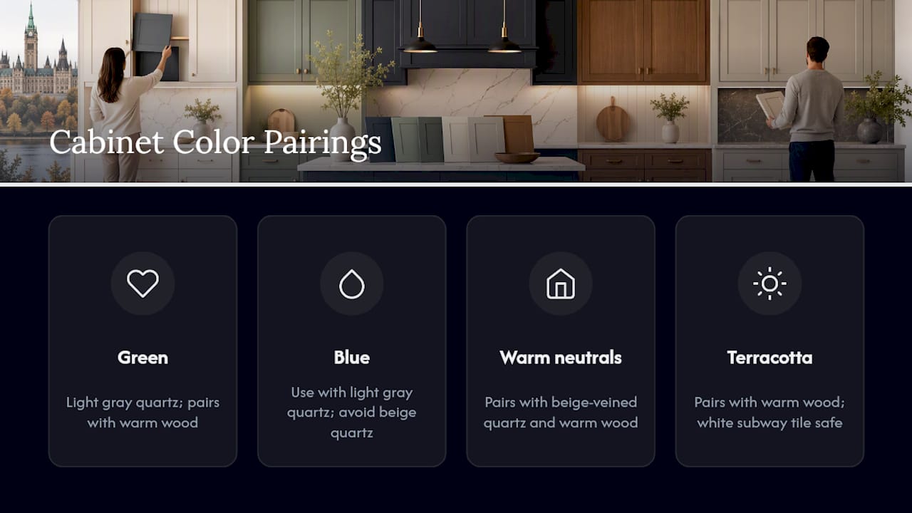
Cabinet color never exists in isolation. It has to work with everything else already fixed in the room, especially the elements that are far more expensive to change.
Start with your countertop, since it’s usually the hardest and most permanent material in the kitchen. White or light gray quartz gives you the most flexibility, working with everything from sage green to navy to charcoal. Warmer countertop materials, like a beige-veined marble-look quartz, tend to clash with cool-toned grays and blues, so lean toward warm neutrals or earth tones instead.
Flooring sets the room’s overall temperature. Warm wood tones (oak, walnut) pair naturally with greens, terracotta, and warm neutrals. Cooler gray-toned floors or tile can handle navy, charcoal, and cooler whites without feeling mismatched.
Backsplash is your easiest and cheapest place to bridge cabinet and countertop colors if they don’t naturally align. A simple white subway tile is nearly foolproof against any cabinet color on this list, while a patterned or colored tile should pick up one existing tone in the room rather than introducing an entirely new one. When in doubt, bring a cabinet sample and a countertop sample to the tile showroom together. Comparing them side by side under the same light avoids the mismatch surprises that only show up once everything’s installed.
How Cabinet Color Shapes the Mood and Feel of a Kitchen
Color changes how a kitchen feels to stand in, not just how it looks in photos. Light, warm neutrals expand a room visually and create an airy, calm atmosphere, which is part of why they remain the safest choice for smaller kitchens or homes preparing to sell.
Deep, saturated colors like navy or charcoal create intimacy and drama. They make a large kitchen feel more grounded and cozy, but the same color in a cramped galley kitchen can feel confining rather than warm. Green sits in an interesting middle ground: it’s calming like a neutral but carries enough saturation to feel intentional and current rather than a placeholder color.
Terracotta and warm earth tones tend to make a kitchen feel more social and lived-in, which is likely why they show up so often as island colors in open-concept homes built around gathering. Perceived space matters as much as mood. Dark upper cabinets in particular can make ceilings feel lower, so if you love a dark color, consider keeping it to the lower cabinets or the island while letting uppers stay light to preserve height and openness.
Prepping Cabinets Before Painting to Protect Color Fidelity
The color you choose will only look right if the surface underneath is properly prepared. Skipping prep is the single fastest way to end up with a finish that looks nothing like your sample.
Every cabinet surface needs a thorough clean and degrease first, since kitchen cabinets accumulate a film of cooking grease that prevents paint and primer from bonding properly. After cleaning, a light sanding scuffs the existing finish so the new coat has something to grip. Any dents, dings, or gaps need filling and caulking before a single coat of paint goes on, since paint highlights surface flaws rather than hiding them.
Primer choice matters more than most DIYers expect. A stain-blocking or shellac-based primer prevents old wood tannins or stains from bleeding through and shifting your carefully chosen color over time. Skipping primer, or using the wrong type, is a recipe for disaster: uneven color, visible blotching, and a finish that fails within a year or two. Manufacturer guidance backs a straightforward professional formula: one coat of the right primer, followed by two topcoats, applied evenly and given proper cure time between each layer.
Common Mistakes to Avoid When Choosing Cabinet Colors
Even homeowners with a good eye for design fall into a handful of predictable traps when picking cabinet colors.
Trusting a tiny paint chip. A 2-inch swatch can’t show you undertones, and it never accounts for your kitchen’s actual lighting.
Ignoring the countertop and floor already in place. A gorgeous color in isolation can clash badly once it’s sitting next to your existing materials.
Chasing a trend with no exit plan. Bold, highly specific colors can date faster than neutrals; if resale is a concern within five to seven years, weigh that risk honestly.
Skipping the sample stage entirely. Committing to a full kitchen repaint based on a photo from someone else’s kitchen is asking for a mismatch.
Choosing sheen as an afterthought. A beautiful color in the wrong sheen (too flat, too glossy) can undercut the whole look.
Forgetting about hardware. Brass, black, and nickel all read differently against the same paint color, and swapping hardware later doesn’t always save a mismatched combination.
What Painters and Designers Actually See Play Out
The gap between a trendy color and a color you’ll still love in five years comes down to undertone, not saturation. A well-chosen dark navy tends to age better than a poorly chosen trendy green, because undertone consistency matters more than which family you pick. We’ve watched homeowners fall in love with a bold accent island on a sample board, then ask us to tone it down to a smaller footprint once they see it against their actual countertop. That instinct, to test big before committing big, is the difference between a kitchen that still looks right in 2031 and one that needs a redo in three years.
— Ottawa
Get Your Kitchen Cabinet Color Right the First Time
Picking the right shade is only half the job. Getting a flawless, durable finish on it is the other half, and that’s where Ottawacabinetpainting saves homeowners from the guesswork and mess of a DIY repaint or a full cabinet replacement. Our process pairs a local color consultation, built around Ottawa’s specific light conditions, with professional spray application, thorough prep, and a project timeline of around ten days from start to finish. Every job is backed by a 6-year warranty, so the color you choose today still looks right years from now. If you’ve settled on a direction from this guide, whether that’s a warm neutral, a sage green, or a bold navy island, request a free quote and let’s talk about what it takes to bring it to life in your kitchen.
Sources
Recommended
Comments